The psychology of colour: creativity vs. âme tooâ design
03 Mar 2015
Speed dating and direct mail have something important in common: first impressions are vital. One needs to create a good overall effect quickly. But of course that’s only the first step. You won’t seduce anyone in three minutes, but you could easily disqualify yourself. University research in Winnipeg, Canada showed that people make up their minds within 90 seconds of their initial interactions with either people or products. Between 62 and 90 per cent of the assessment is based on colours alone.
The challenge for direct mail is to attract attention, to open a conversation between publisher and audience - but to do it in a way that serves to embody the client’s brand values, not to work against them. Colour is an obvious tool for a designer looking to attract and keep an audience, but the desire to engage has to be tempered with an understanding of brand, corporate ID and relevance.
As readers we detect signals in everything we see, gaining clues from colour, typography, and images to come quickly to an initial opinion about a piece of print. An old estate agent once told me that in his opinion: “All buyers are liars.” Not all clients are liars but when they tell you that they want a completely new look, they don’t really mean it. It’s just that they think they do.
Take a typical example. How often does a financial institution re-launch itself along the lines of “we are a completely new bank, suited to your modern lifestyle”? Well how new are they? How new can a bank be? Well not very. They take deposits and they lend money and pay your bills. They might offer you discounted membership of the AA, cheap theatre tickets and bizarre pictures of dogs in woolly hats but essentially retail banks take our money in, give it back out again and keep some for themselves - probably too much.
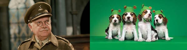
Branding: Old bank vs. New bank.
If they are to succeed we need to trust them with our money - that’s why the UK government bailed the banking sector out to the tune of £500 billion in 2008. I’ll say that again - £500 billion. Trust - that’s one hell of a core value. Any campaign that stresses “new and different” over trust and reliability will fall on its face. The new bank might want to appear more friendly and approachable - but it is still a bank.
In the western world, we associate certain colours with certain values: bright red with excitement or danger, green with envy, blue with dependability, grey with passivity, black with solidity and soberness. These seem like clichés, but they are borne out by academic research. So when we design, do we stick to the accepted wisdom or get bold and adventurous? There may be a good reason not to boldly go where none have gone before. On the old TV comedy Yes Minister, whenever Sir Humphrey of the civil service wanted to dissuade minister Jim Hacker from a course of action, he had only to tell him that he was making “a courageous decision”. There is safety in the anonymity of the middle ground. Or to put it another way no one has ever won an argument with a customer - even when they have followed the literal content of a client brief.
It turns out that they didn’t want “new” at all - they wanted different - but the same.
And for one reason they are right. In any aspect of communication the more barriers to the message that you place in front of the reader, the less chance you have of success. Colours, fonts images even paper choice must speak to the assumptions and built-in prejudices of the audience. So our design becomes “me too” rather than just “look at me.”
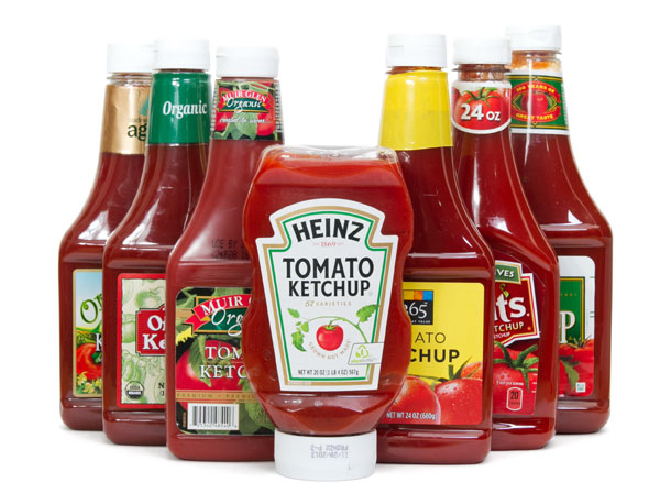
So by conforming to popularly held associations, what do we get? We find ourselves working within a restricted palette rather than going wild. As a result design becomes increasingly similar. If companies are chasing a brand leader their instinct is to copy it - which is why car designs grow increasingly similar and all mainstream ketchup bottles look like Heinz.
Design trends: Follow the leader…
There is however a cause and effect element at work here that confuses the public. We believe that colours represent qualities because some firms use them - even if the colours weren’t chosen for that reason or corporate performance is at odds with the perception. We see blue for example as dependable because it is used in brands that have dependability as a core value. That didn't help Barclays during the financial meltdown of 2008, any more than the fact that Morgan Stanley’s logo is black, which denotes stability. On the other hand, HSBC, currently mired in a global tax evasion mess, has a red logo, a colour that is synonymous with danger and excitement.
You can take this stuff too far. And some do - Analytics company Kissmetrics produced an infographic that purports to show the link between corporate colours and emotions. Frankly it makes about as much sense as reflexology or tarot cards.
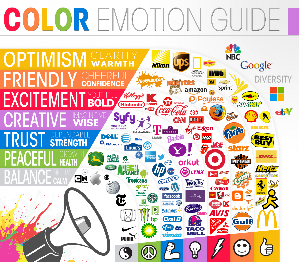
Gratuitous infographic: Colour therapy for the intellectually challenged.
Just because MacDonald’s, Ferrari, Subway, Nikon and UPS all have yellow logos doesn’t mean they have anything else in common. The ascribed emotions of optimism, clarity and warmth might conceivably be associated with the colour yellow but do you associate those emotions with Hertz or Schweppes? I don’t. Red is said to be bold and youthful - but it’s also the colour of the logo for the Rolling stones (combined age 281 years and counting).
Hallmark cards and Yahoo both have purple logos - so they are associated with creativity and wisdom. Really? The American boobs and burger chain Hooters describes itself as “delightfully tacky yet unrefined” but has a brown logo, which according to the pseudo-science of colour denotes friendly cheerful confidence (not unrefined tackiness). Or maybe it’s just because owls (as in hooters - geddit?) are brown. Facebook is blue, but only apparently, because Mark Zuckerberg is colour blind but can distinguish that colour.
And what do we make of Google with its red, blue, yellow and green? Make of what you will - I think it just looks bright and quite attractive.
There is a logic to colour use - but it has nothing to do to retro-fitting random ‘meanings’ to brand identities. For reasons that have never been sensibly explained, we are hard-wired in our attraction to the colour red. And the attributes that we associate with the colour have nothing to do with danger or stop signs on traffic lights.
Colour prejudice: It’s usually best to bet on red.
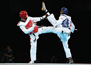
In a lab experiment, taekwando judges were shown two sets of films of fights between red- and blue-helmeted opponents. One set of fights was shown just as they were recorded. For the other set, the helmet colours were digitally switched. In both cases, the red-helmeted fighters were adjudged to have won 55% of the time. Generally in judged sporting contests red-clothed competitors tend to win out if the opponents are closely matched.
It’s only in recent times that 50 shades of grey has denoted anything other than tedium.
It goes further - research shows that goalkeepers that wear red shirts do better in penalty shoot-outs. In cities where there are two football teams: one with red shirts and the other with another colour, the red team tends to predominate: Liverpool - Everton, Aston Villa - Birmingham, Man Utd - Man City (arguable today), Bristol City - Bristol Rovers. It’s not an infallible guide.
In our brains, red is actually associated with action - not inaction. If you add a call to action button (like ‘Buy Now’) on a website, a red button will outperform a green one by some 27 per cent, when used in tests on otherwise identical sites.
It’s only in recent times that 50 shades of grey has denoted anything other than tedium, although judging by the film reviews, that at least hasn’t changed.
Chris Perrelle is a director of Colophon (www.colophon.co.uk) the London direct markting, design and print management agency.


Please login to comment.
Comments